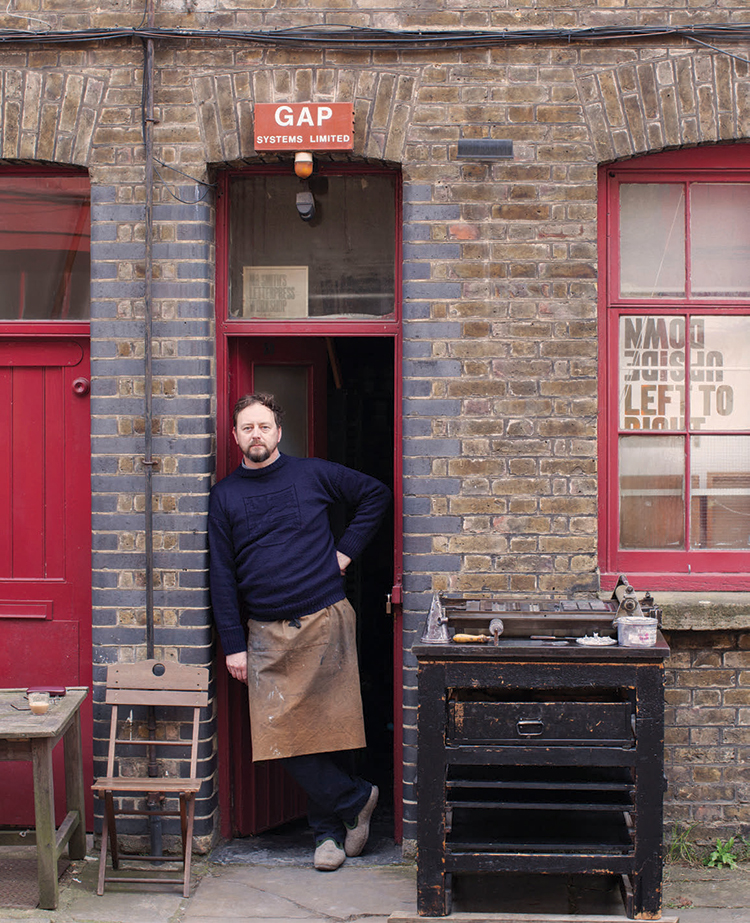
Entering the charming, 19th century cobbled street of Iliffe Yard in Kennington, where my studio, Mr. Smith’s Letterpress, is located, feels like stepping back in time. Surprisingly peaceful within such an urban setting, the yard was built as part of The Pullens Estate. Designed with artisans and small traders in mind, the area originally comprised 600 dwellings surrounding four working yards, which allowed people to both live and work on the premises. Fast-forward to today, and some 300 flats and 3 yards remain—home now to a thriving mix of creatives.

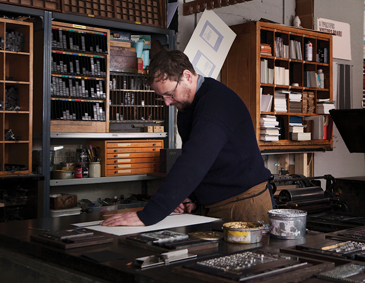
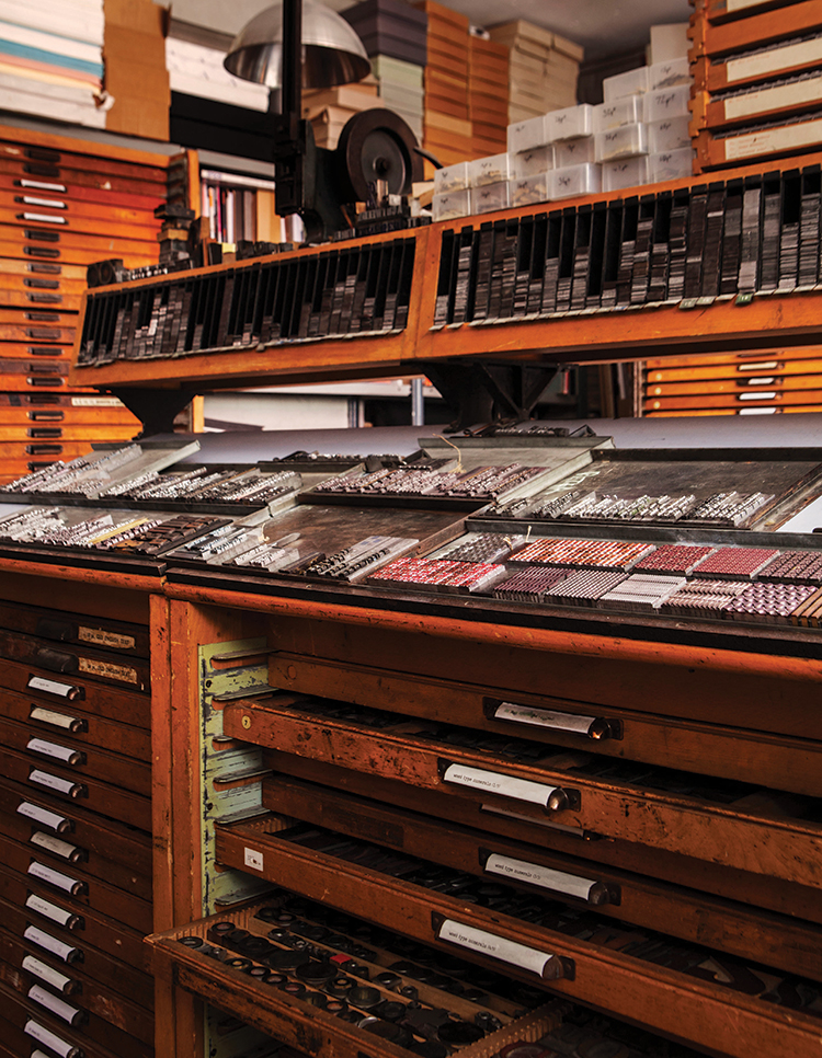
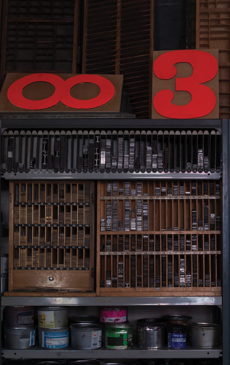
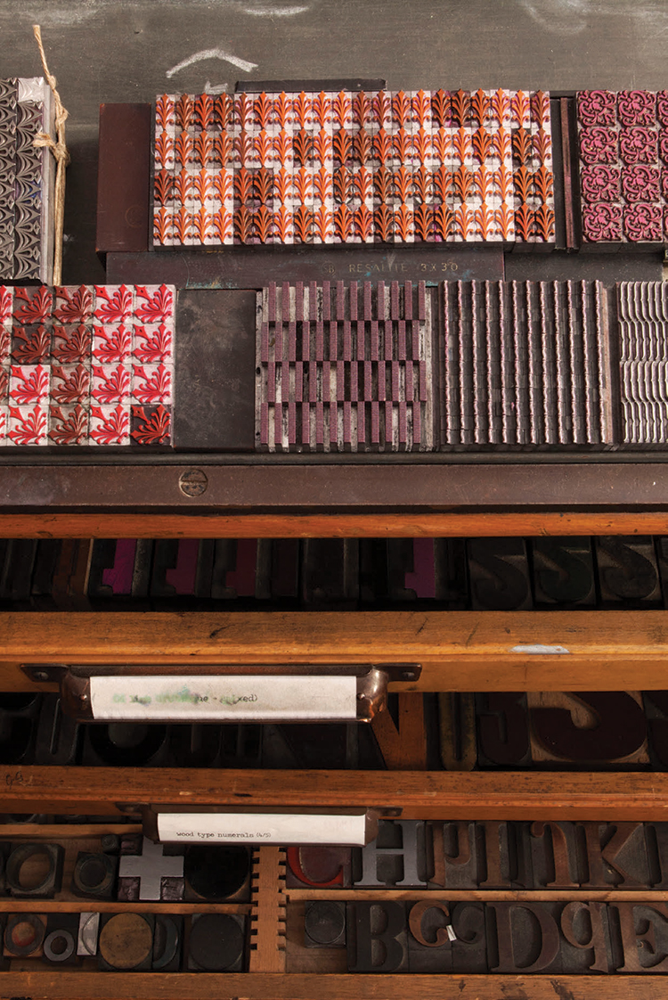
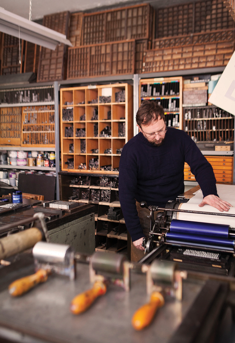
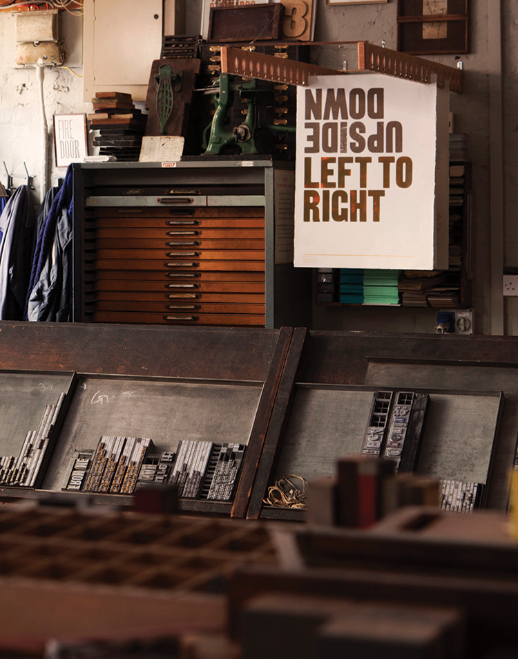
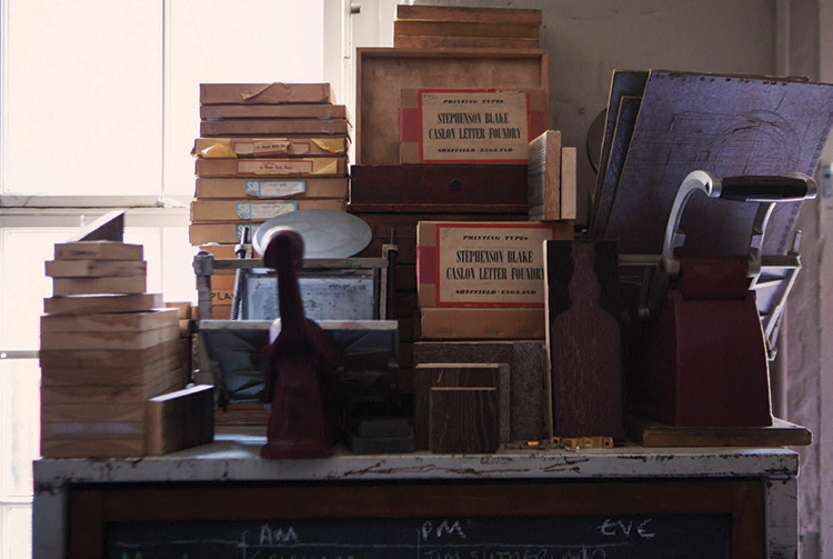
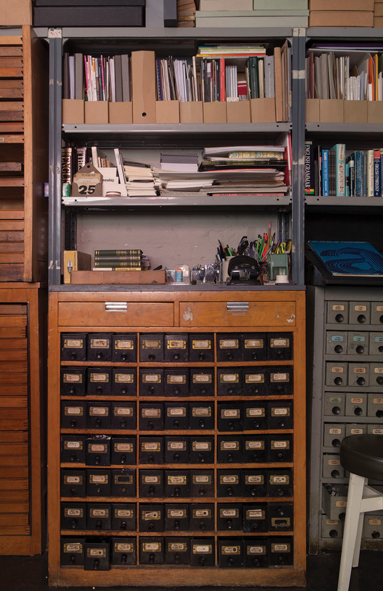
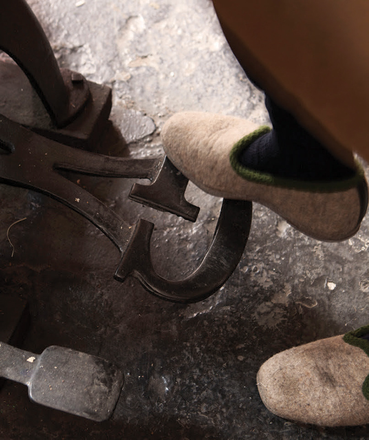
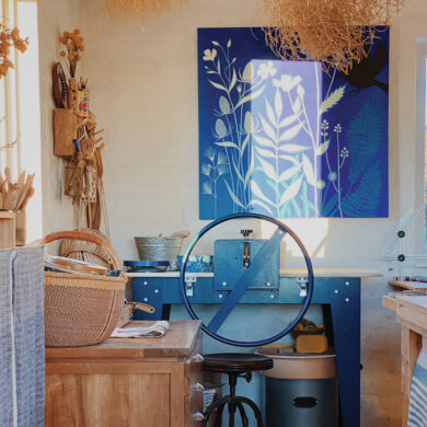
The brick-fronted facade, with its bold, red-painted door and decoratively arched windows, leads into my workshop, where the strong aroma of ink and welcoming clunk of original letterpress machines in action hark back to a printing era that is now more exception than norm. The workshop reflects my desire for precision, calm, structure and order and is set out specifically to aid the flow of the design process—aesthetically pleasing yet intrinsically practical. Collecting slowly, I have curated one of the largest collections of original English printing presses, letterpress furniture, cabinets and tools that are used daily in my work.

I was drawn to letterpress after studying graphic design at Norwich School of Art. Mac technology was rising to the fore, and people were becoming fixated with modern design methods. I was the opposite; I wanted to make my own work, mix my own inks, choose my own papers and explore my own typography to produce handcrafted original designs. I am passionate about preserving this traditional skill but do so with contemporary thinking.
“There are only a few designer makers who use letterpress as an integral part of all their work.”

After four years fine-tuning my craft as a master letterpress apprentice while also completing a Master’s degree in film and sequential design, I set-up Mr. Smith’s Letterpress Workshop in 1996, with help from the Crafts Council. From the beginning, my business aimed to give a contemporary dimension to traditional printing techniques.

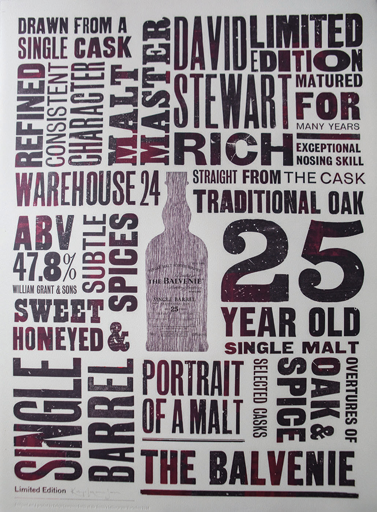
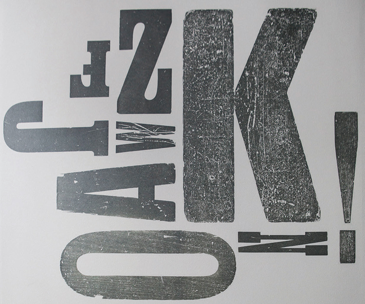
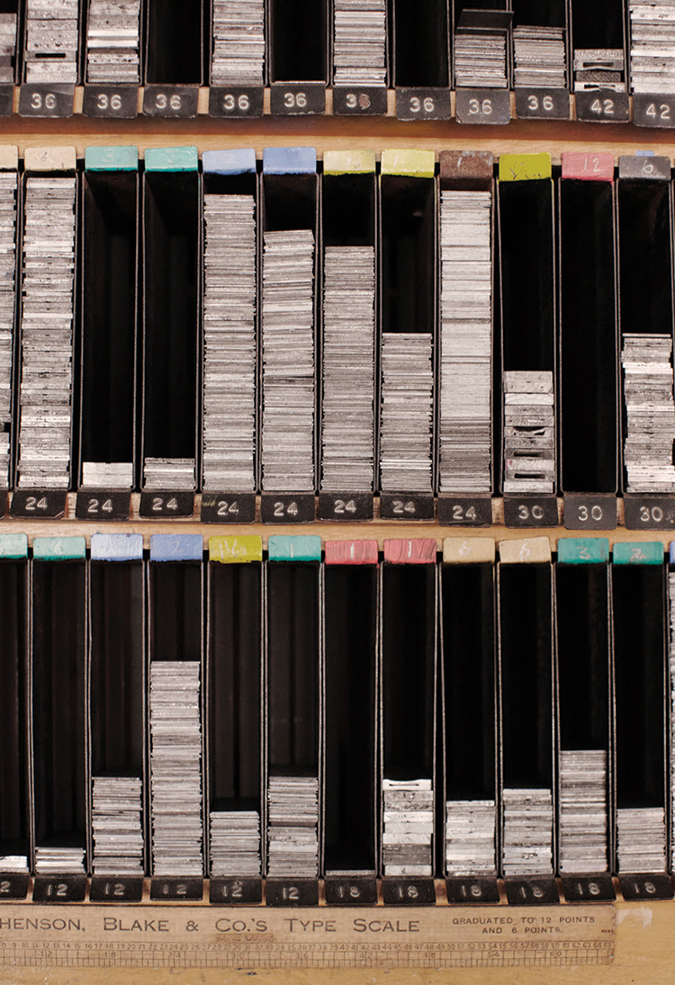
Ten years later, at the age of 36, I moved into my current workshop, where I now produce a mix of typographical prints, bespoke books, invitations and corporate brand advertising commissions. Currently, I am finalizing an environmental landart project with a leading homebuilder in the West Country. I also recently launched a line of stationery notebooks as a collaboration with the high-end paper mill James Cropper in Cumbria, as well as rulers made from locally sourced wood and designed with a traditional “type scale”—a font-measuring device that is the most vital tool in a letterpress workshop.

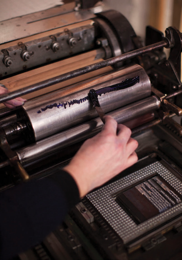
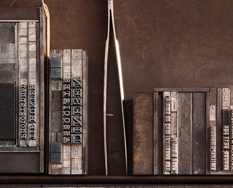
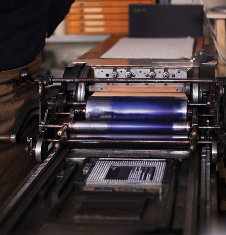
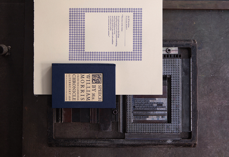
The letterpress process ensures every piece of work undergoes three stages: design, set and print. To get to the finished product, you have to think about how people will read and see it as you physically “set” the type ready for the press. It forces you to edit and be precise with your words. The design stage is laid out on a “stone”—a heavy steel bench where type is constructed three-dimensionally until it looks and feels correct. It is then transferred to the press, where ink colors and papers are considered, and the set type transferred into the press to make a proof. Before the final print, I tend to leave the proof for a few days to consider any refinements.

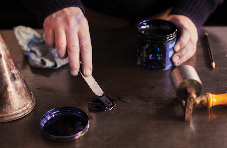
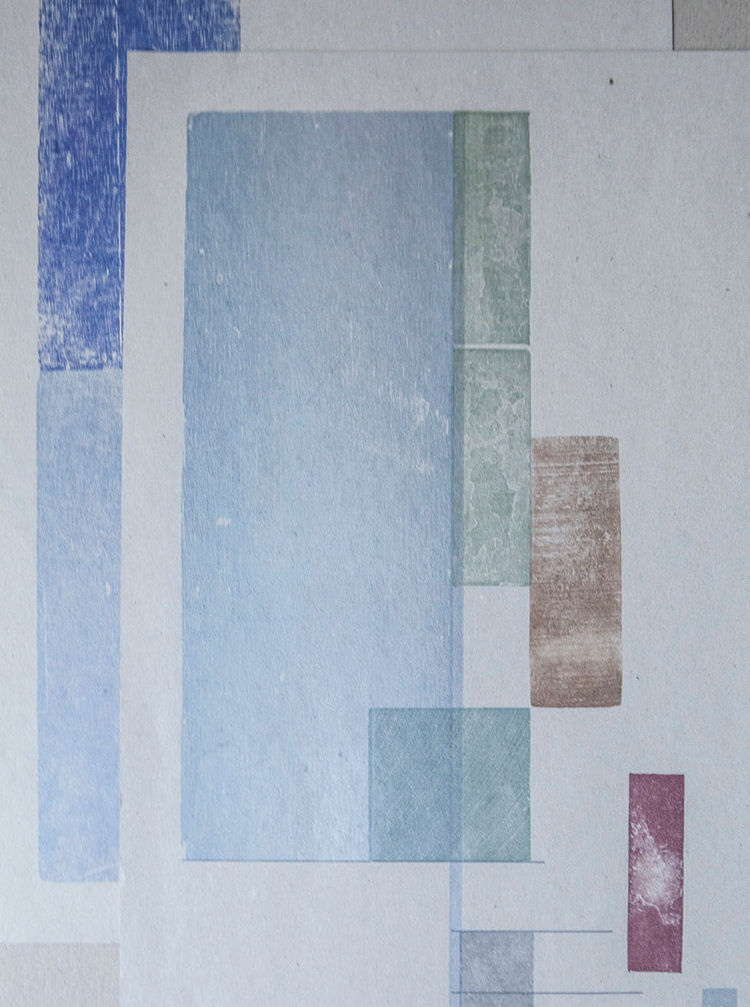
My printmaking paper of choice is BFK Rives & Somerset. They are moundmade, 100 percent cotton, acid-free, watermarked papers that have a lovely deckle edge. My favorite paper is BFK Rives Grey. It has a gorgeous soft grey/green tone and a chalky but smooth surface. It takes type beautifully and the chemistry with the letterpress inks is very special. I use Van Son letterpress inks. They tend to “stay open” (not dry) longer and have a rubber base to help stability.

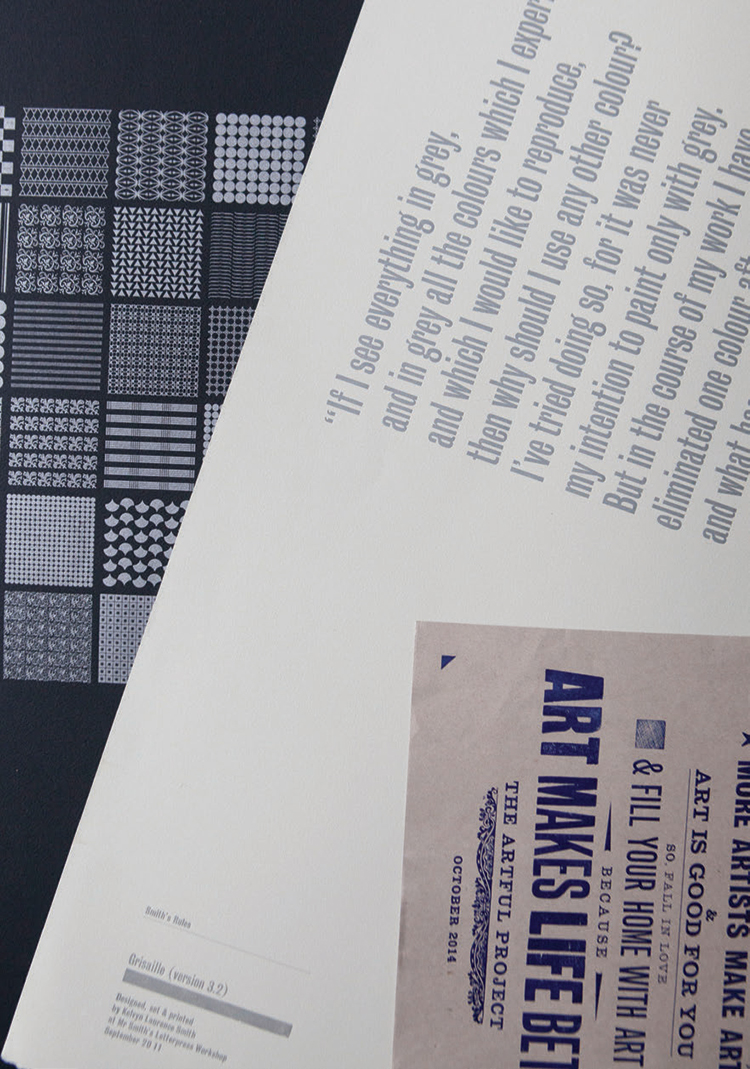
I combine the rigorous design, set, print process with my own set of “Smith’s Rules,” a set of parameters that are considered for each piece of work and include consideration for composition, color, scale, typeface, hierarchy, texture, surface, ink and paper. Smith’s Rules also pay homage to a modest book that was used in printing workshops called “Hart’s Rules,” a small manual that clarified the correct usage of typesetting rules and punctuation.

It’s human instinct to be drawn to feel the textures and to physically hold something created by hand. For me, the craftsmanship provides the perfect antidote to digital technology. Pieces that have been lovingly constructed maintain a personal resonance and a feeling of provenance, but with a modern edge relevant today.

Entering the charming, 19th century cobbled street of Iliffe Yard in Kennington, where my studio, Mr. Smith’s Letterpress, is located, feels like stepping back in time. Surprisingly peaceful within such an urban setting, the yard was built as part of The Pullens Estate. Designed with artisans and small traders in mind, the area originally comprised 600 dwellings surrounding four working yards, which allowed people to both live and work on the premises. Fast-forward to today, and some 300 flats and 3 yards remain—home now to a thriving mix of creatives.

The brick-fronted facade, with its bold, red-painted door and decoratively arched windows, leads into my workshop, where the strong aroma of ink and welcoming clunk of original letterpress machines in action hark back to a printing era that is now more exception than norm. The workshop reflects my desire for precision, calm, structure and order and is set out specifically to aid the flow of the design process—aesthetically pleasing yet intrinsically practical. Collecting slowly, I have curated one of the largest collections of original English printing presses, letterpress furniture, cabinets and tools that are used daily in my work.

I was drawn to letterpress after studying graphic design at Norwich School of Art. Mac technology was rising to the fore, and people were becoming fixated with modern design methods. I was the opposite; I wanted to make my own work, mix my own inks, choose my own papers and explore my own typography to produce handcrafted original designs. I am passionate about preserving this traditional skill but do so with contemporary thinking.
“There are only a few designer makers who use letterpress as an integral part of all their work.”

After four years fine-tuning my craft as a master letterpress apprentice while also completing a Master’s degree in film and sequential design, I set-up Mr. Smith’s Letterpress Workshop in 1996, with help from the Crafts Council. From the beginning, my business aimed to give a contemporary dimension to traditional printing techniques.

Ten years later, at the age of 36, I moved into my current workshop, where I now produce a mix of typographical prints, bespoke books, invitations and corporate brand advertising commissions. Currently, I am finalizing an environmental landart project with a leading homebuilder in the West Country. I also recently launched a line of stationery notebooks as a collaboration with the high-end paper mill James Cropper in Cumbria, as well as rulers made from locally sourced wood and designed with a traditional “type scale”—a font-measuring device that is the most vital tool in a letterpress workshop.

The letterpress process ensures every piece of work undergoes three stages: design, set and print. To get to the finished product, you have to think about how people will read and see it as you physically “set” the type ready for the press. It forces you to edit and be precise with your words. The design stage is laid out on a “stone”—a heavy steel bench where type is constructed three-dimensionally until it looks and feels correct. It is then transferred to the press, where ink colors and papers are considered, and the set type transferred into the press to make a proof. Before the final print, I tend to leave the proof for a few days to consider any refinements.

My printmaking paper of choice is BFK Rives & Somerset. They are moundmade, 100 percent cotton, acid-free, watermarked papers that have a lovely deckle edge. My favorite paper is BFK Rives Grey. It has a gorgeous soft grey/green tone and a chalky but smooth surface. It takes type beautifully and the chemistry with the letterpress inks is very special. I use Van Son letterpress inks. They tend to “stay open” (not dry) longer and have a rubber base to help stability.

I combine the rigorous design, set, print process with my own set of “Smith’s Rules,” a set of parameters that are considered for each piece of work and include consideration for composition, color, scale, typeface, hierarchy, texture, surface, ink and paper. Smith’s Rules also pay homage to a modest book that was used in printing workshops called “Hart’s Rules,” a small manual that clarified the correct usage of typesetting rules and punctuation.

It’s human instinct to be drawn to feel the textures and to physically hold something created by hand. For me, the craftsmanship provides the perfect antidote to digital technology. Pieces that have been lovingly constructed maintain a personal resonance and a feeling of provenance, but with a modern edge relevant today.
